Korodo — Pure Enjoyment
A Bright, Clean Vision for Nicotine-Free Tobacco
Korodo enters the market as a new-generation nicotine-free product in a category long dominated by dark, heavy, and repetitive visual language.
With a clean and honest attitude, Korodo introduces a fresh perspective:
Pure Enjoyment.

Challenge
The Turkish tobacco market has been visually saturated for years with black-heavy palettes, aggressive typography, and harsh graphic tones—an aesthetic that may work for nicotine products but completely contradicts the nature of a light, clean, nicotine-free experience.
Korodo needed to break away from this visual cliché and redefine what nicotine-free tobacco could look and feel like.
The mission:
Create clarity in a market built on darkness.

Strategy
Korodo wasn’t meant to be rebellious.
It wasn’t meant to look sci-fi or hyper-futuristic.
It needed to be pure, bright, and honest.
Three core principles shaped the brand’s foundation:
Purity — A white, clean, open visual space.
Brightness — Vivid, fresh fruit imagery expressing flavor identity.
Balance — A modern, youthful appeal without becoming childish or exaggerated.
These principles formed the blueprint for the brand’s entire visual ecosystem.

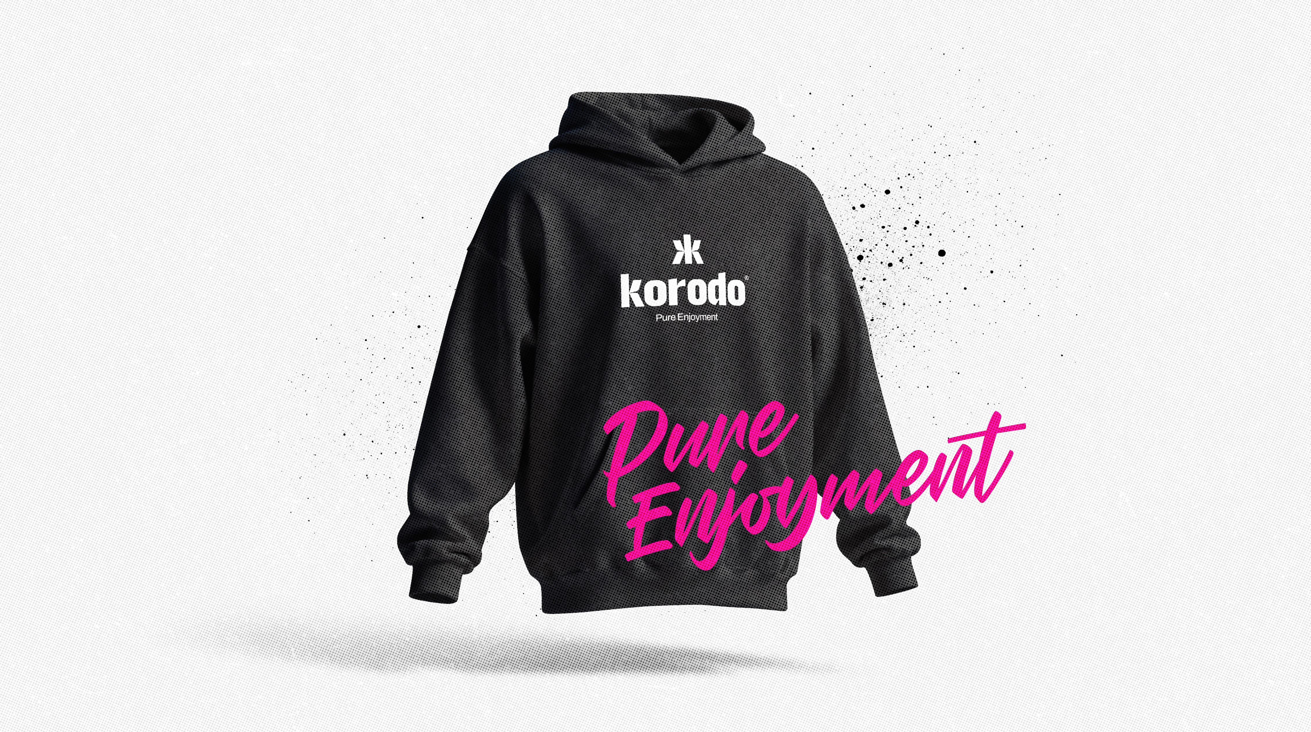
Korodo’s identity is built on one central behavior:
clarity without noise.
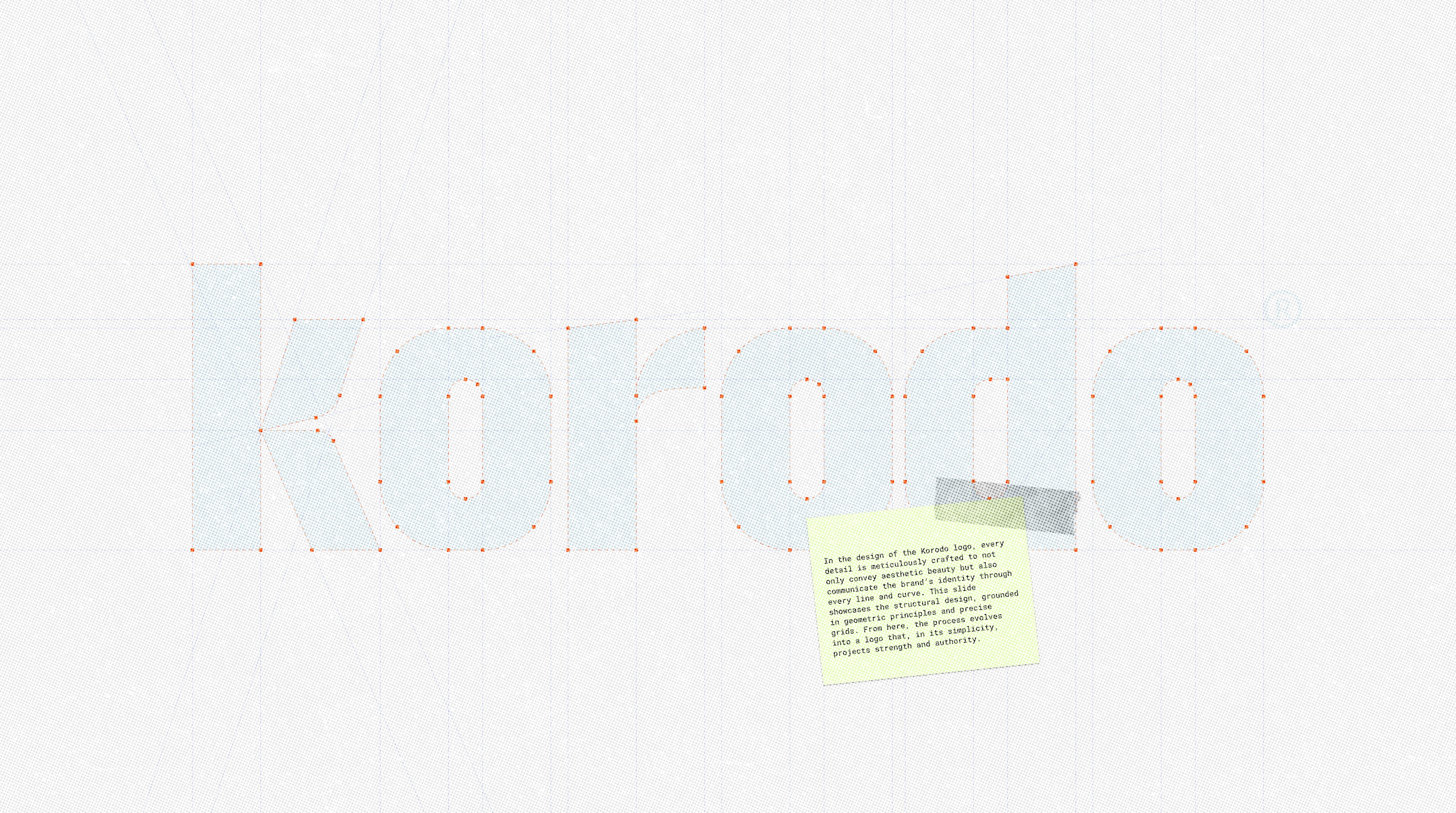
The logotype is crafted through precise geometry and structural grids.
Every curve and angle carries its own purpose:
strength through simplicity, confidence without shouting.
A bold, clean typographic system supports the brand’s tone—direct, modern, and unmistakably clear.

Korodo Base Colors
Psychology of color in branding
Korodo’s base palette is built on contrast with intention:
darkness acknowledged, brightness embraced.
White Smoke leads.
Night supports.
Clarity wins.
Accent
Korodo’s accent colors are driven directly by flavor.
Rather than acting as decorative elements, accent colors function as emotional and sensory cues—each one representing a distinct taste, mood, and experience.
Bright fruits, vivid tones, and high-contrast compositions bring energy into the brand system, balancing the purity of the white base with moments of intensity and pleasure.
These colors create recognition, differentiation, and memorability across the product range.
Accent colors allow Korodo to stay clean and minimal at its core, while still feeling alive, expressive, and rich in flavor.


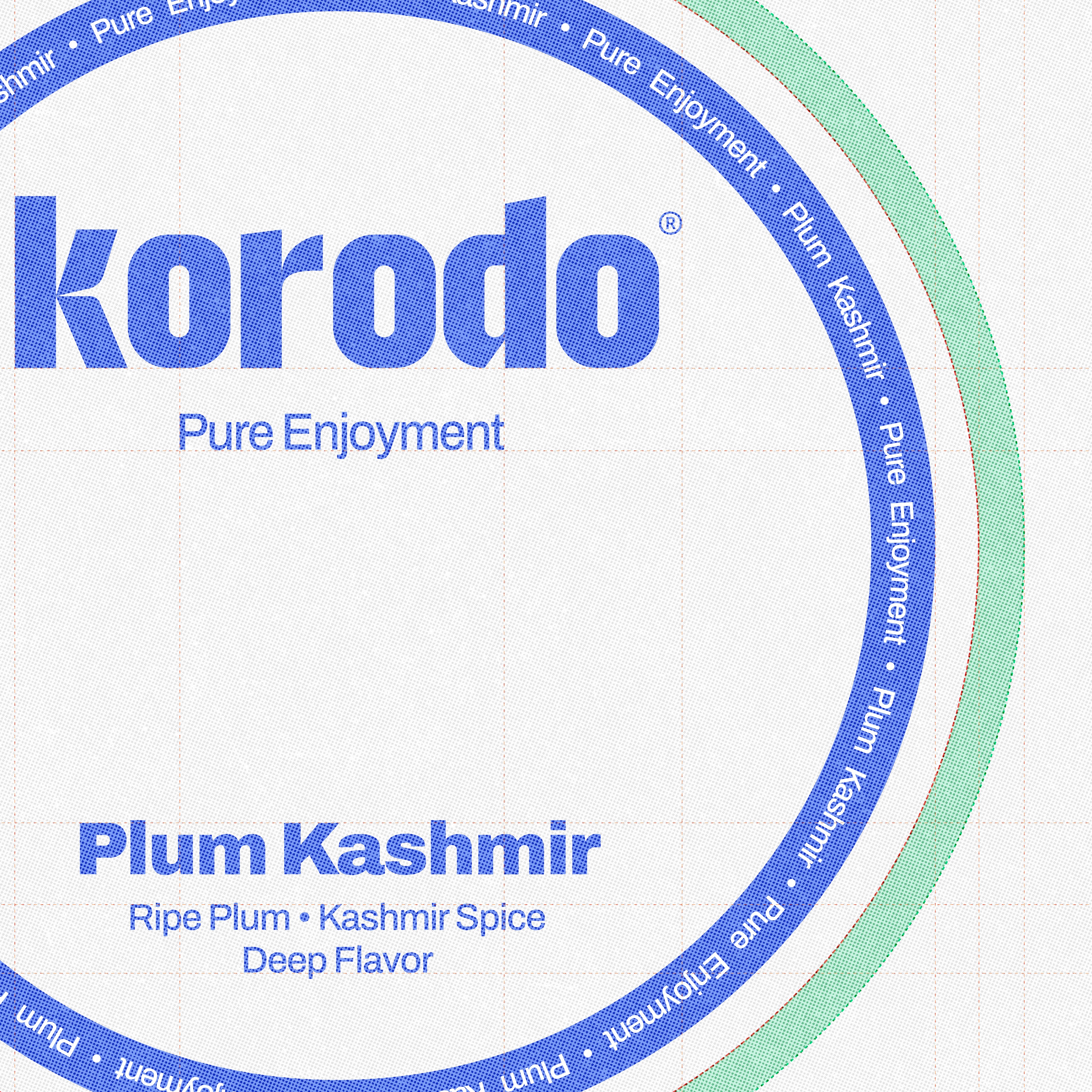
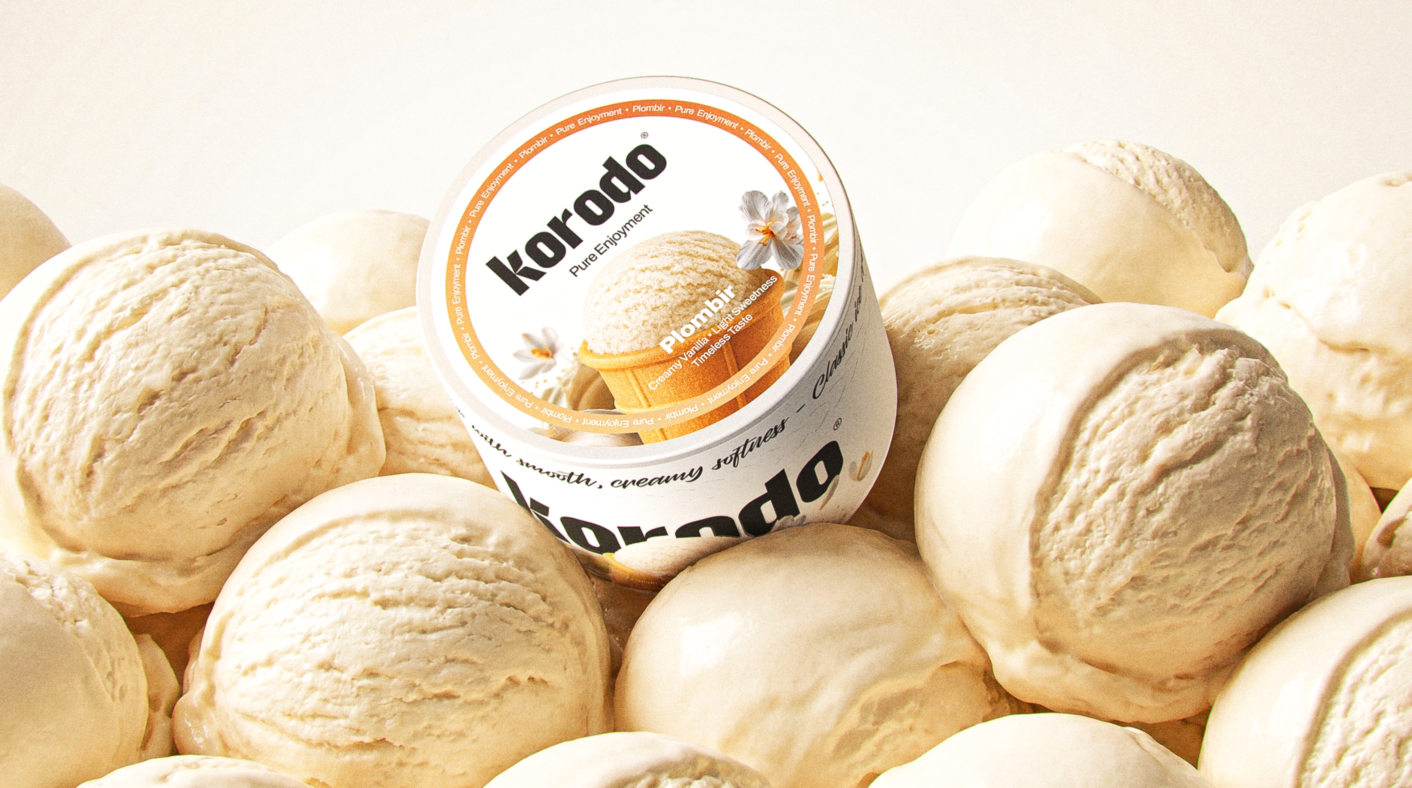
Packaging System
Designed for Clarity and Consistency
The Korodo packaging system was built to balance structure and flexibility across a growing product range.
Every element is designed to work as part of a unified system—clear, scalable, and instantly recognizable.
A consistent layout grid ensures brand coherence, while flavor-specific elements introduce variation without breaking the visual order. Information hierarchy is kept clean and readable, allowing users to understand the product at a glance.
White space plays a key role in communicating the nicotine-free nature of the product, while color, typography, and imagery guide attention toward flavor and experience.
The result is a packaging system that feels light, confident, and organized—supporting both shelf visibility and long-term brand growth.


Result
Korodo entered the market with:
• A cohesive and distinctive brand identity
• A premium packaging system ready for scale
• Cinematic 3D launch content for social media
• A structured visual system for long-term communication
Korodo®
Project Overview
Korodo is a new nicotine-free tobacco brand created to challenge the dark, traditional aesthetic of the Turkish tobacco market. From identity to packaging and motion, the entire brand was built from the ground up with one mission:
bring clarity, purity, and brightness to a category defined by heaviness.
We crafted a complete visual and product ecosystem that communicates freshness, trust, and flavor-driven enjoyment—establishing Korodo as a clean, modern alternative in a crowded market.