The Challenge
The category was crowded.
Most competitors relied on loud graphics, predictable flavor coding, and generic “premium” aesthetics.
DUSK needed to:
Enter the market with authority
Visually differentiate from established players
Build an instantly recognizable identity
Communicate premium strength without visual noise
Create launch content that felt cinematic, not commercial
The challenge was not visibility.
It was distinction.

We Needed To
Before designing anything, we aligned on three critical objectives:
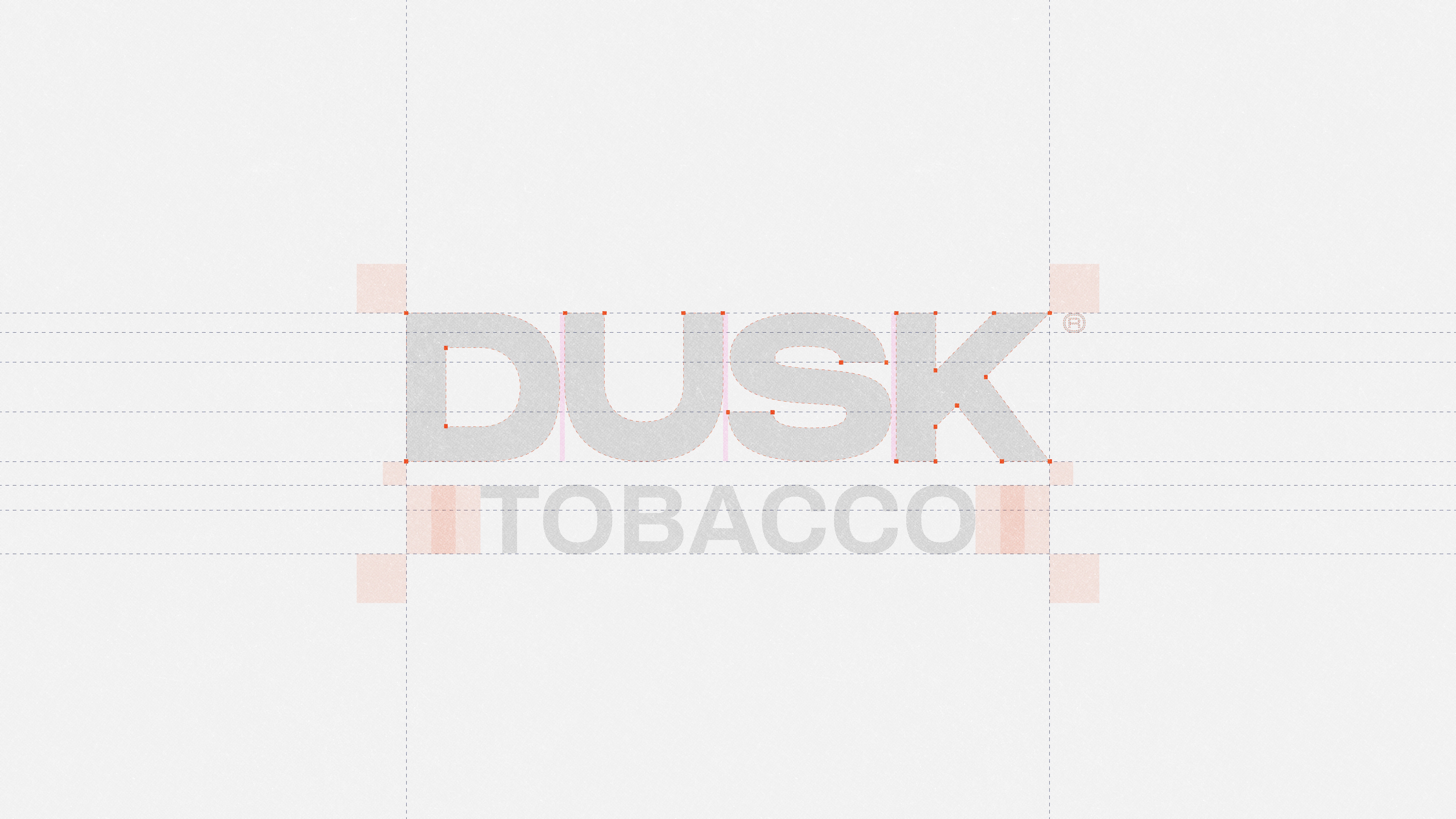
1-Define a strong personality — not just a logo.
2-Build a packaging system that feels powerful even in silence.
3-Create visual content that transforms the product into an experience.
Every decision had to reinforce one core idea:
DUSK is not made for everyone.
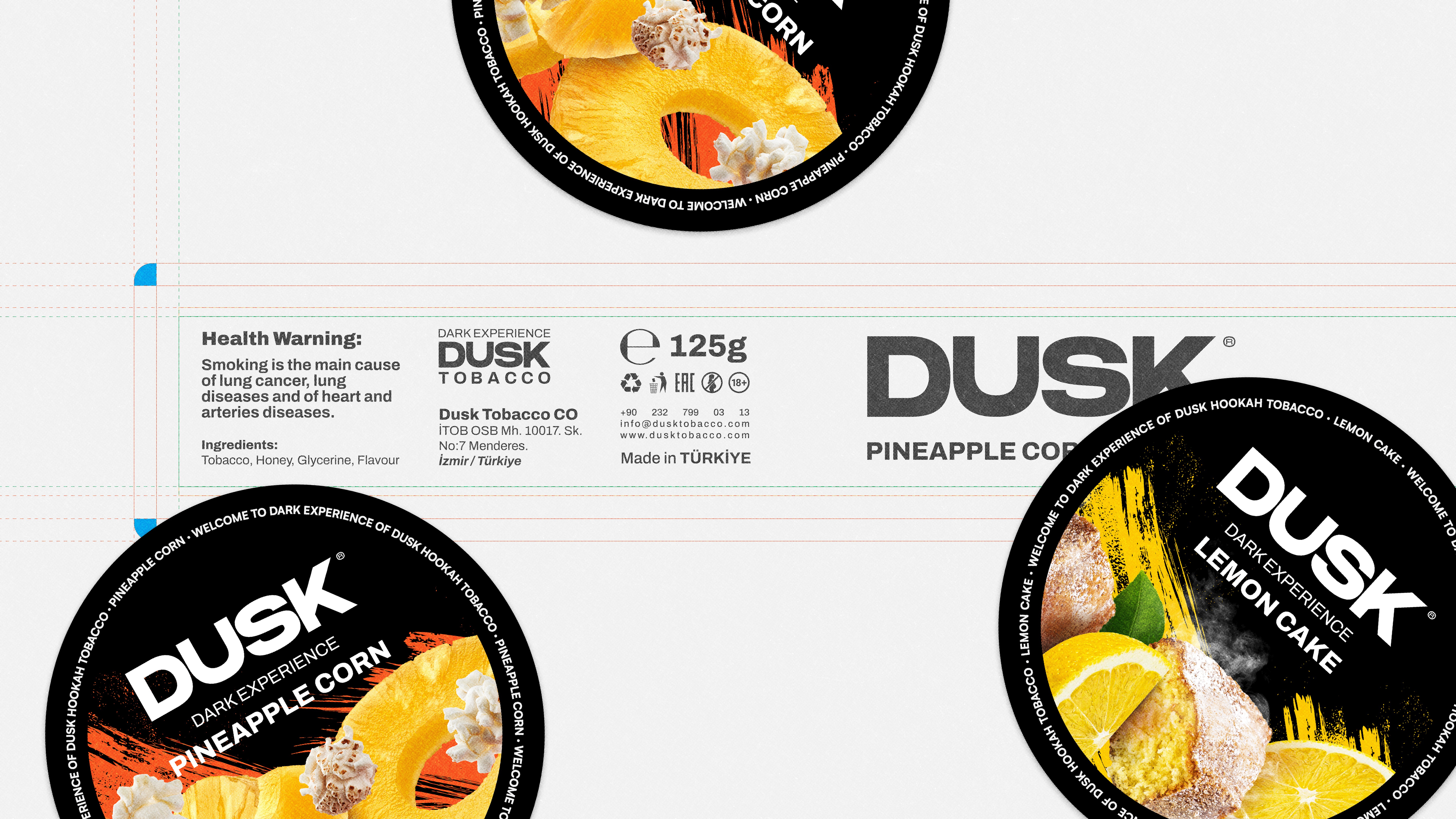
" First thing we could see on the brief from our client “Dusk”, was the mention of the brand new product name: Dark Tobacco. A brand new line of products with a dark-colored tone - hence the name - that is set to be in the premium class of what they produce. By embracing the name of this new line-up, we knew we had one task: creating dark, tense, and serious visuals, and putting the colored labels that represent every flavor at the center of the frames.
Creating dark-themed visuals and putting the focus on labels that each represent a flavor resulted in the products to pop up in the video and getting the attention they needed. "

Erfan Karimi
Sr. Motion Designer and 3D Artist at Red Flare DDA

Creative Direction
The creative direction was built around the concept of
Controlled Darkness.
We developed a visual language rooted in:
• Deep, dominant black surfaces
• High-contrast lighting inspired by cinematic environments
• Textural realism (charcoal, sparks, smoke, depth)
• Minimal yet confident typography
• Bold but refined flavor differentiation
Packaging was designed as a tension between restraint and explosion:
a dark, minimal base disrupted by expressive flavor imagery.
For social and campaign visuals, we moved beyond static design.
Through high-end 3D modeling and animation, we created a world around the product:
embers, smoke, texture, atmosphere — turning a container into a narrative object.
This wasn’t product visualization.
It was brand world-building.

Arian Tajik
Founder & Creative Director


“DUSK was about discipline.
We had to resist overdesigning.
The power of the brand came from what we chose not to show.”— 3D & Visual Lead, Red Flare DDA
Result
DUSK entered the market with:
• A cohesive and distinctive brand identity
• A premium packaging system ready for scale
• Cinematic 3D launch content for social media
• A structured visual system for long-term communication
The brand did not look like a newcomer.
It looked established from day one.
More importantly, DUSK didn’t compete visually.
It dominated visually.
DUSK®
Project Overview
DUSK was not launched as just another product in the market.
It was conceived as a bold, unapologetic brand entering a saturated and visually repetitive category.
Red Flare DDA was commissioned to build DUSK from the ground up — not only visually, but strategically.
From brand identity to packaging, from cinematic 3D content to launch-ready visual systems, we designed every layer required for a powerful market entry.
This was not a redesign.
This was a brand birth.
