BRAND STORY
More Than a Place to Work Out.
MAESTRO was conceived as a place where movement becomes part of a broader way of living.
Fitness, swimming, recovery, coaching, social spaces and everyday experiences exist within one connected environment, allowing members to move between performance, restoration and community without leaving the world of the brand.
This broader definition of wellbeing became the starting point for the identity. Instead of presenting MAESTRO as a collection of facilities, we positioned it as one living ecosystem — a club built around continuous progress and designed to become part of everyday life.
A place to move, connect and live better.
BRAND HEART
Before defining how MAESTRO should look, we defined what the brand needed to stand for.
Its strategic foundation brings performance, wellbeing and human connection into the same system — creating a clear framework for every experience, communication and decision that follows.
Core Strategic Principles
Continuous Progress
Uncompromising Quality
Community & Belonging
Respect Every Journey
Performance With Balance
Experience By Design


A new signature for movement.

LOGO
Geometry of Movement
A Symbol Built Between Precision and Motion.
The MAESTRO symbol begins with a simple recognition: the letter M.
But its meaning extends beyond the initial.
Its angular rhythm draws from the visual language of a heartbeat — an expression of life, movement and continuity. The shifting geometry gives the mark a sense of momentum while maintaining the control and precision expected from a premium performance brand.
Every proportion and intersection was constructed as part of a disciplined geometric system.
The result is a symbol that brings together the central idea behind MAESTRO: physical wellbeing, mental balance and purposeful movement existing as one.


Crafted, Not Typed.
The MAESTRO wordmark was not selected from an existing typeface.
Every character was individually drawn and refined to create a visual signature that belongs specifically to the brand.
Proportion, stroke weight, spacing and optical balance were developed alongside the symbol, allowing the two elements to behave as one coherent identity across physical and digital environments.
The result is not simply a name set beside a logo.
It is a recognizable piece of the MAESTRO system.
Closing Line
More than a wordmark, it is the visual signature of MAESTRO.


Colors That Define Movement.
The MAESTRO color system was created around the same balance that defines the brand itself: control and energy.
Deep neutrals establish the premium foundation of the identity. High-energy accent colors then enter selectively to create rhythm, direct attention and signal moments of action.
Rather than using color decoratively, each tone has a role.
Rich Black brings authority. Platinum creates space. Tomato introduces physical intensity. Green Yellow works as an active signal. Electric Blue adds digital energy, while the Midnight-to-Mint gradient introduces a calmer expression for recovery and wellbeing.
Together, the palette allows MAESTRO to change pace without changing personality.
Accent
Accent colors introduce controlled bursts of energy into the MAESTRO visual system. Tomato expresses physical intensity and momentum, Green Yellow acts as an active signal, and Electric Blue brings a sharper, more digital character. Used selectively against the brand’s neutral foundation, these colors create rhythm, distinction and flexibility without compromising MAESTRO’s premium identity. Together, they allow the brand to move naturally between performance, recovery and social experiences while remaining unmistakably MAESTRO.


One identity. Different forms of movement.
BRAND IN MOTION


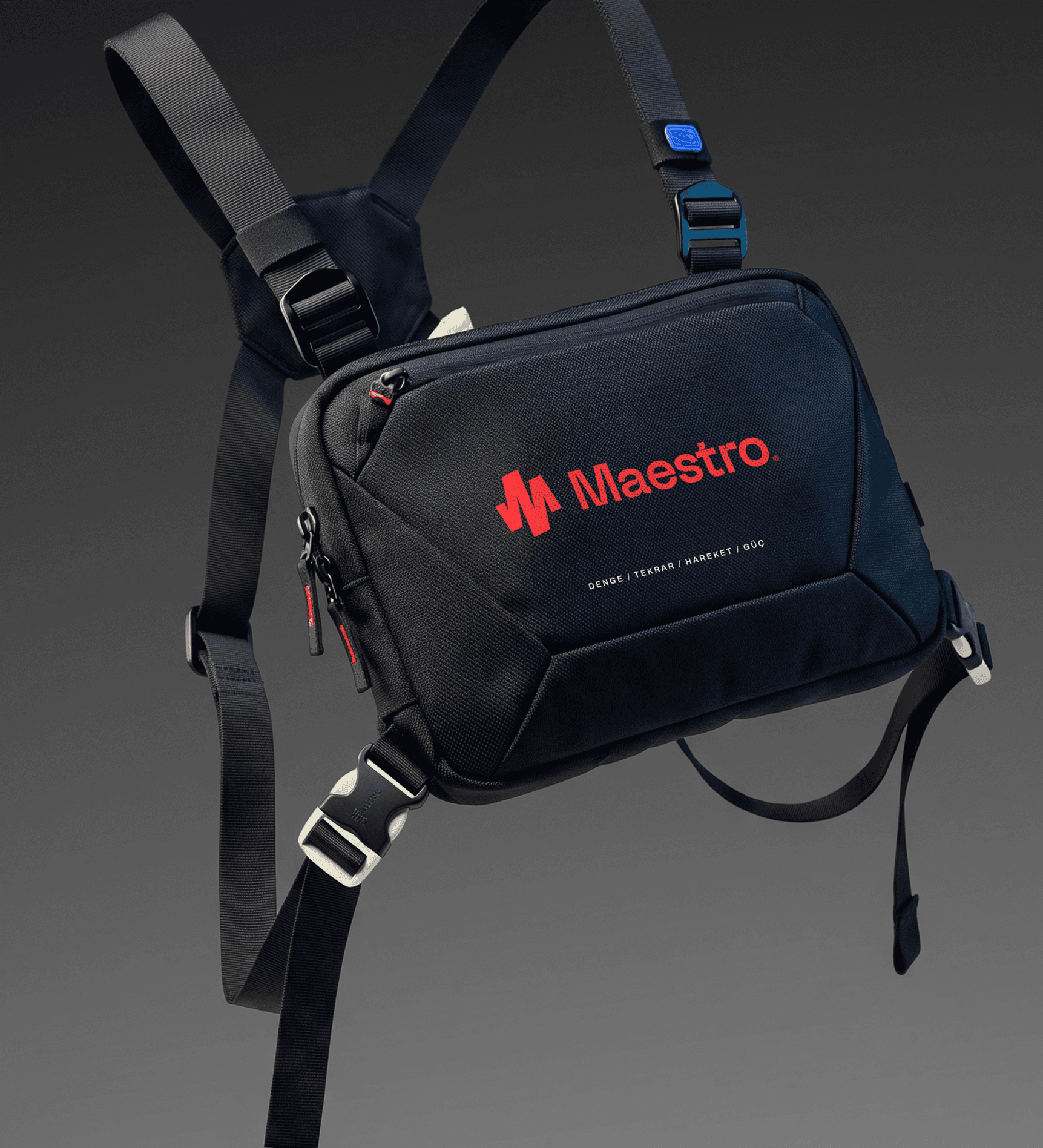


COMMUNICATION SYSTEM
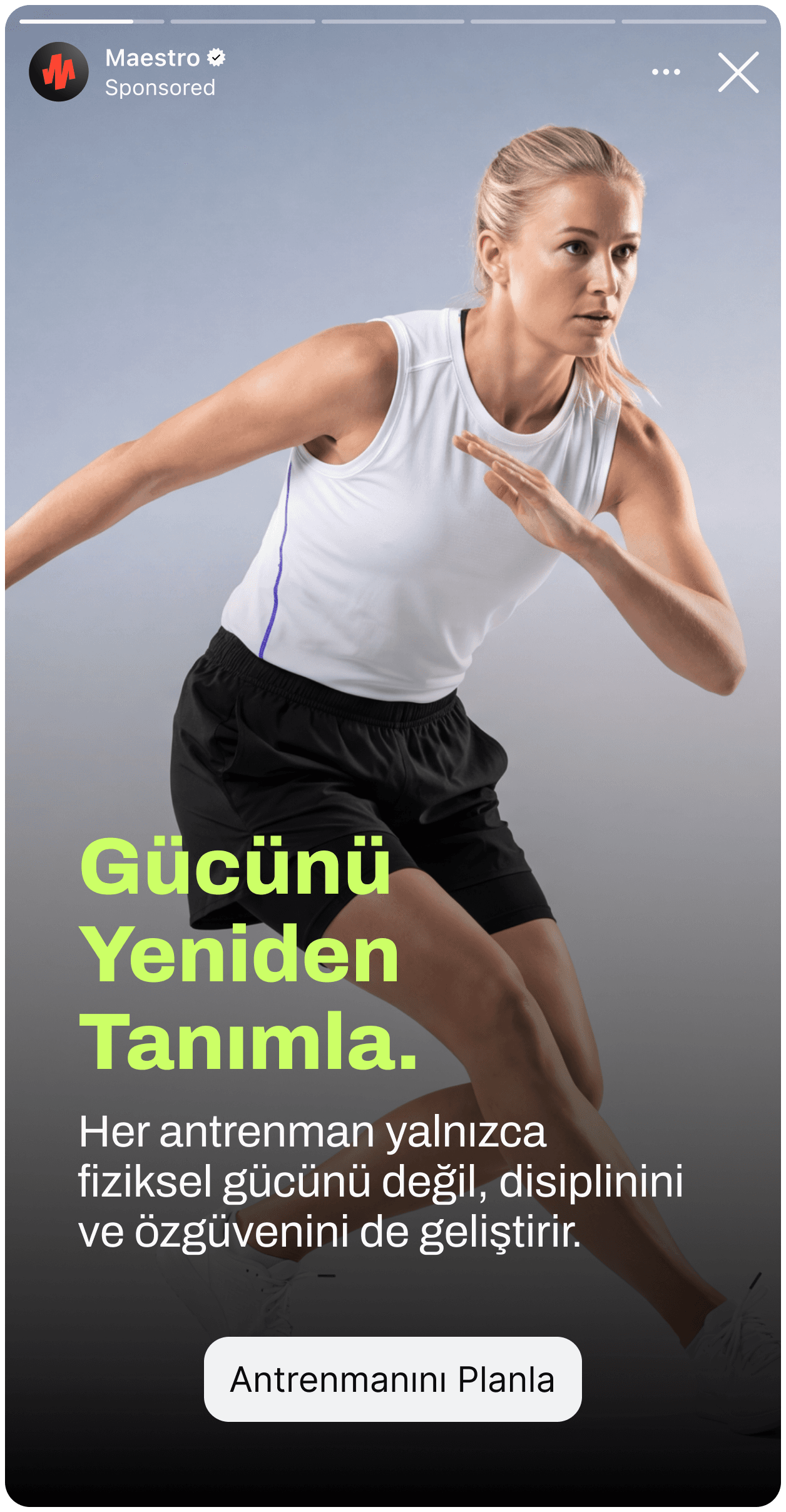
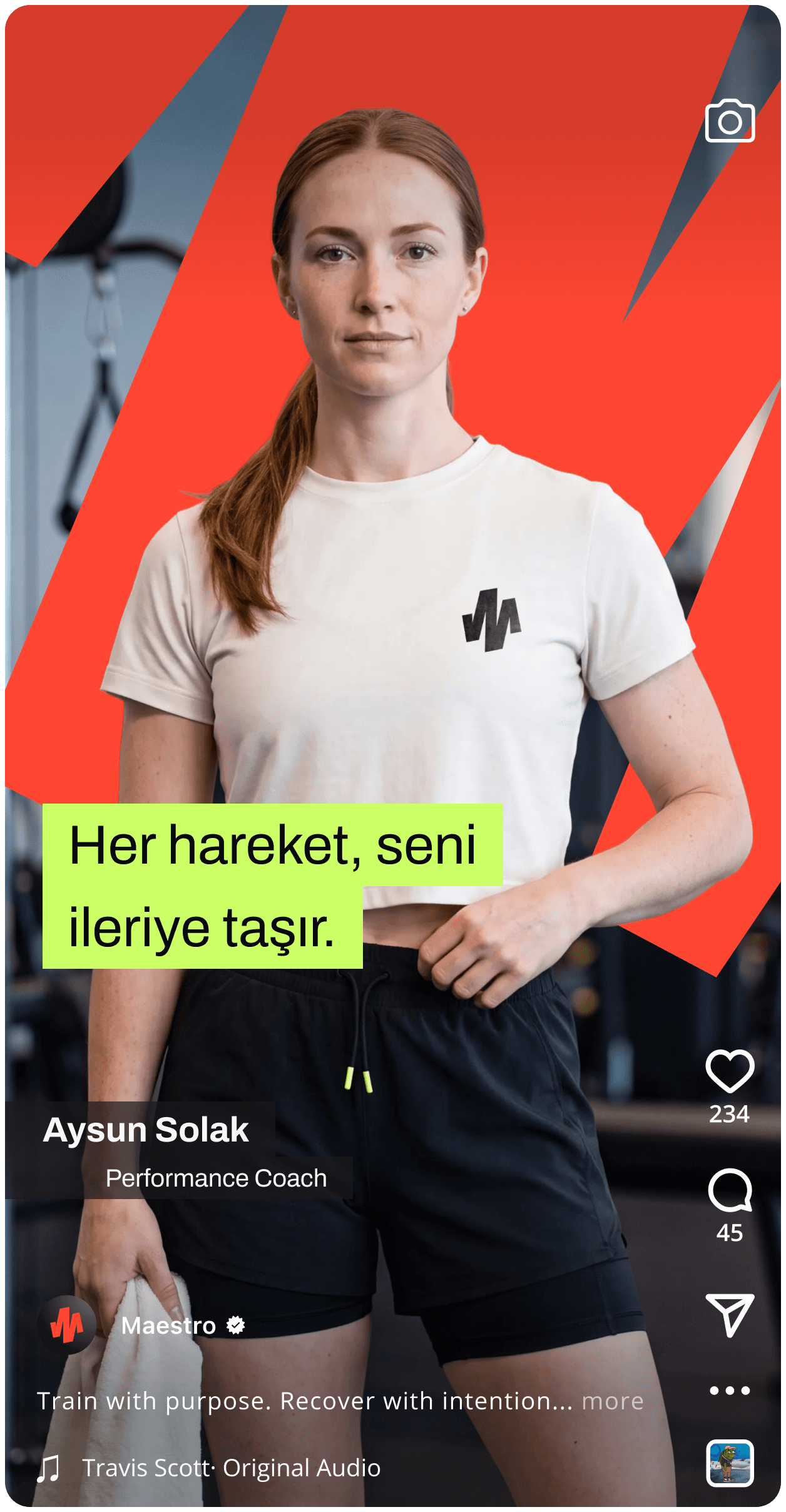
MAESTRO speaks with the same clarity as it moves.
The verbal identity avoids complicated fitness language and exaggerated promises in favor of short, direct statements that can motivate without becoming aggressive.
The language is active, confident and human.
It does not tell people what they should become.
It gives them a reason to keep moving.


Maestro
Project Overview
ONE CLUB. EVERY EXPERIENCE.
MAESTRO is a contemporary sports and lifestyle club bringing fitness, swimming, personal and group training, recovery, coaching and social connection into one integrated experience.
The challenge was to create a brand capable of holding all of these worlds together without becoming another conventional fitness identity.
We built MAESTRO around purposeful movement — a strategic and visual system that connects performance with wellbeing, discipline with community, and physical progress with everyday life.
The result is an identity designed not simply around what happens inside the club, but around how people want to feel when they leave it: stronger, more connected and ready to move forward.
